公司最近人手不足,于是,又开始折腾起Html来了
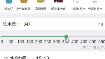
本文主要讲slider滑块的实现、样式自定义、刻度绘制、与输入框的联动我们先来看看效果图
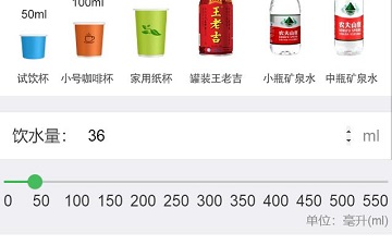
h5 slider.gif上图中,我们需要实现的难点就是那个绿色的滑块,其它都是输入框及文本框,容易实现。
滑块的实现
其实,只要设置input的type,即可实现滑块功能
<input id="slider" type="range" min="0" max="550" step="1" /> // step表示滑动的最小步长效果如下:
range.jpg样式自定义
虽然实现了滑块的效果,但是感觉有点太丑了,主要是和设计相差太远,于是,我们来美化下,先看看css
/**
 * @range.css
**/
.ne-range_thumb,
input.ne-range[type=range]::-webkit-slider-thumb {
  width: 2em;
  height: 2em;
  border-radius: 50%;
  border: 0/**1px solid #45bd5c*/;
  background-color: #5cdf84;
  box-shadow: 0 1px 4px rgba(0, 0, 0, 0.21);
  -webkit-transition: border-color 0.15s, background-color 0.15s;
  transition: border-color 0.15s, background-color 0.15s;
  cursor: pointer;
  background-clip: padding-box;
  box-sizing: border-box;
}
.ne-range_thumb:active,
input.ne-range[type=range]::-webkit-slider-thumb:active {
  border: 0/**1px solid #45bd5c*/;
  background-color: #5cdf84;
}
.ne-range_track,
input.ne-range[type=range] {
  width: 100%;
  height: 8px;
  border-radius: 8px;
  margin: .8em 0;
  padding: 0;
  cursor: pointer;
  border: 0;
  /**background-color: #45bd5c;*/
  background: -webkit-linear-gradient(#40c35f, #40c35f) no-repeat #cccccc;
  background-size: 0% 100%;
}
.ne-range_track > span {
  display: block;
  width: 0%;
  height: 100%;
  background-color: #40c35f;
}
.ne-range_tips {
  position: absolute;
  margin-top: -2em;
  width: 6em;
  text-align: center;
  margin-left: -3em;
}
.ne-range_thumb > .ne-range_tips {
  margin-left: -2.15em;
}
.ne-range_tips > span {
  position: relative;
  display: inline-block;
  padding: 0 3px;
  min-width: 1.2em;
  color: white;
  background: rgba(0, 0, 0, 0.5);
  border-radius: 3px;
  text-align: center;
}
.ne-range_tips > span::after {
  content: '';
  position: absolute;
  left: 50%;
  bottom: -0.25em;
  margin-left: -0.3em;
  border: 0.3em solid rgba(0, 0, 0, 0.5);
  border-right-color: transparent;
  border-left-color: transparent;
  border-bottom: 0;
}
/*Real Range*/
input.ne-range[type=range] {
  position: relative;
  outline: 0;
  -webkit-appearance: none !important;
}
input.ne-range[type=range]::-webkit-slider-thumb {
  -webkit-appearance: none !important;
}
/*Virtual Range*/
.ne-range {
  display: inline-block;
  position: relative;
  width: 100%;
  font-size: 1em;
}
.ne-range_thumb {
  position: absolute;
  top: 0;
  margin-left: -0.85em;
}
.ne-range_thumb.ondrag > .ne-range_tips {
  visibility: visible;
}
有点多,说下关键点,thumb相关的是设置滑块按钮(即那个圆点)相关属性,track即那一条滑动条。
需要注意的是下面两行代码background: -webkit-linear-gradient(#40c35f, #40c35f) no-repeat #cccccc; background-size: 0% 100%;background设置了-webkit,因为我这边是针对手机端;-linear-gradient表示线性渐变,括号中两个颜色值都是#40c35f,此时就是纯色的绿色;no-repeat表示背景图像仅出现一次,不会重复出现;最后的#cccccc则定义了右边没有滑到的区域为灰色。
而background-size设置了两个宽度百分比,分别是#40c35f占的百分比和#cccccc占的百分比,这里都是相对于整个滑块区域来讲的。
关于线性渐变,下面一张linear-gradient(#cccccc, #000000)供参考linear-gradient(#cccccc, #000000).png说完css,我们在来看看html
<input type="range" id="slider" name="slider" class="ne-range" value="0" style="margin-top: 4vw;"/>和之前的基本一致,这里没有设置min,max,step等,留在后面js中设置,没什么大的区别
$.fn.RangeSlider = function (cfg) { this.sliderCfg = { min: cfg && !isNaN(parseFloat(cfg.min)) ? Number(cfg.min) : null, max: cfg && !isNaN(parseFloat(cfg.max)) ? Number(cfg.max) : null, step: cfg && Number(cfg.step) ? cfg.step : 1, callback: cfg && cfg.callback ? cfg.callback : null }; var $input = $(this); var min = this.sliderCfg.min; var max = this.sliderCfg.max; var step = this.sliderCfg.step; var callback = this.sliderCfg.callback; $input.attr('min', min) .attr('max', max) .attr('step', step); $input.bind("input", function (e) { $input.attr('value', this.value); $input.css('background-size', this.value * 100.0 / max + '% 100%'); if ($.isFunction(callback)) { callback(this); } }); }; var change = function ($input) { /*拖动滑块的事件,内容可自行定义*/ } $('#slider').RangeSlider({ min: 0, max: 550, step: 1, callback: change });这里注意,绑定的是公式输入有误input.css,这里我们改变background-size第一个百分比就可以达到左侧绿色覆盖的目的。
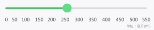
这里就完成了滑块的基本功能。刻度绘制
但是,离上面效果图还有蛮大差距的。比如上面的刻度,这里我取巧使用了宽度百分比来直接绘制了数字:
<div class="ne-cell-center" style="width: 9%"><label class="ne-label" style="color: #333333; font-size: 3.2vw">0</label></div> <div class="ne-cell-center" style="width: 9%"><label class="ne-label" style="color: #333333; font-size: 3.2vw">50</label></div> <div class="ne-cell-center" style="width: 9%"><label class="ne-label" style="color: #333333; font-size: 3.2vw">100</label></div> <div class="ne-cell-center" style="width: 9%"><label class="ne-label" style="color: #333333; font-size: 3.2vw">150</label></div> <div class="ne-cell-center" style="width: 9%"><label class="ne-label" style="color: #333333; font-size: 3.2vw">200</label></div> <div class="ne-cell-center" style="width: 9%"><label class="ne-label" style="color: #333333; font-size: 3.2vw">250</label></div> <div class="ne-cell-center" style="width: 9%"><label class="ne-label" style="color: #333333; font-size: 3.2vw">300</label></div> <div class="ne-cell-center" style="width: 9%"><label class="ne-label" style="color: #333333; font-size: 3.2vw">350</label></div> <div class="ne-cell-center" style="width: 9%"><label class="ne-label" style="color: #333333; font-size: 3.2vw">400</label></div> <div class="ne-cell-center" style="width: 9%"><label class="ne-label" style="color: #333333; font-size: 3.2vw">450</label></div> <div class="ne-cell-center" style="width: 9%"><label class="ne-label" style="color: #333333; font-size: 3.2vw">500</label></div> <div class="ne-cell-center" style="width: 9%"><label class="ne-label" style="color: #333333; font-size: 3.2vw">550</label></div> <div class="align-right"><label class="ne-label" style="font-size: 2.5vw">单位:毫升(ml)</label></div>当然有很多更好的办法,至少可以写个js循环,但是第一次写h5,还是先实现功能再考虑优化吧。
到这里,我们就实现了一个滑块,效果图如下:slider.jpg与输入框联动
但是,最初的效果图中,滑块是可以和上方的输入框联动的。于是,我们再定义一个数字输入框:
<input id="amount" name="amount" class="ne-input" placeholder="只允许输入数字" pattern="\d*" type="number">要达到输入框内容跟着滑块变化,我们需要改下上面js中的change方法,让滑块滑动时,改变amount输入框的值
        var change = function ($input) {
            /*拖动滑块的事件,内容可自行定义*/
            $("#amount").val($input.value);
        }
然后,当输入框输入数字时,我们的滑块也需要跟着一起移动:
        $('#amount').bind("input", function (e) {
            var value = 0;
            // 过滤下输入内容,因为个别特殊机型手机在input设置了只能输入数字后还是能输入符号
            if (/^[1-9][0-9]*/.test(this.value)) {
                value = this.value;
            }
            // 这里保证输入最大值为550,与滑块一致
            if (this.value > 550) {
                value = 550;
                $("#amount").val(550);
            }
            // 这里设置滑块的值和css
            $("#slider").val(value).css('background-size', value * 100.0 / 550 + '% 100%');
        });
至此,我们就完成了滑块及相关功能:
h5 slider.jpgps:中间虽然还有一些css没有给出,但是都是无关紧要的,比如div的class中ne-cell对应的css,就是一些常规的布局,相信会h5的肯定比我这个刚接触几天时间的人熟悉。另外,刚接触h5,写得有问题的地方多谢指出及纠正。
完成滑块功能时,也是网上找资料,其中主要借鉴了以下博文:
https://blog.csdn.net/u013347241/article/details/51560290作者:ThinkinLiu
链接:https://www.jianshu.com/p/54fd0f8f8481
來源:简书
简书著作权归作者所有,任何形式的转载都请联系作者获得授权并注明出处。